Building this site's header
January 3, 2024
01/03/2024
Put 2 SVG files, CSS filters, and keyframes in a small saucepan on low heat, let simmer 20 minutes.
I'm currently in the midst of a site rewrite, and while I'm planning on a more full post describing my process and decisions, I thought I'd write up a more bite-sized chunk people may find useful.
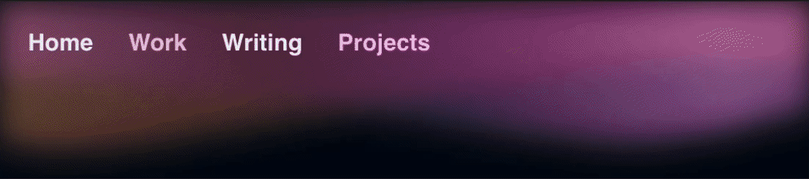
For a while during this rewrite, the header design consisted of just the
navigation links with position: sticky and backdrop-filters applied to blur
the content underneath. I thought this was a bit underwhelming for what I was
going for, and I was feeling inspired after reading
Chris Nicholas's site
refresh blog post and some of the discussion about
website headers on the HN post.
I didn't set out to make a header very similar to Chris's, but it did turn out to match pretty well with his design brief of aurora, coming at it from a different direction.
Process
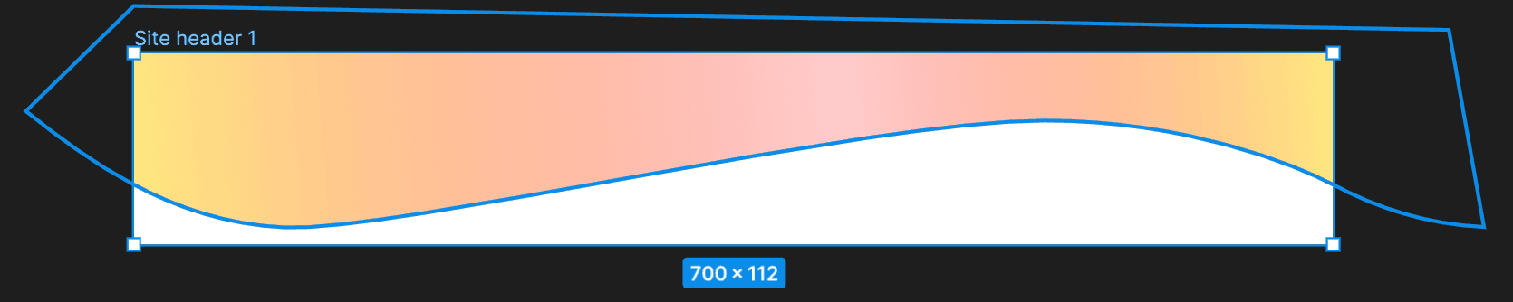
I started out taking inspiration from my opengraph image:

The idea is to take the yellow wave gradients, flip them, and set them behind the navigation links like so:

Going further, we can animate them in CSS using background-position to give
them a more dynamic look. This means our SVGs will need to tile horizontally.
Creating the SVGs
SVG has a number of benefits for a use-case like this. It's a vector format, so it will scale to any devices the page will appear on without pixelation. Also, once you are familiar with SVG syntax, it's fairly easy to make minor changes directly in your code editor rather than having to start over from your vector software.
My vector editor of choice is Figma. To start, I created a frame with roughly the same aspect ratio I was going for, and with 2x my header's height.
To this, add the wavy path that contains the gradient fill. To make the path tile, the right-side border of the frame needs to be identical to the left-side border. To accomplish this, copy the two path vertices that cross the frame's boundary on the left side and move them to the right side of the frame (being careful to keep them at the same height). Then, attach the floating vertices to the rest of the path, and make a boundary outside of the frame so the path is closed and can hold the gradient fill.
The gradient also needs to tile. To do this, make the fill a linear gradient that is perfectly horizontal with three stops: one on the left border of the frame, one somewhere in the middle, and one on the right border.
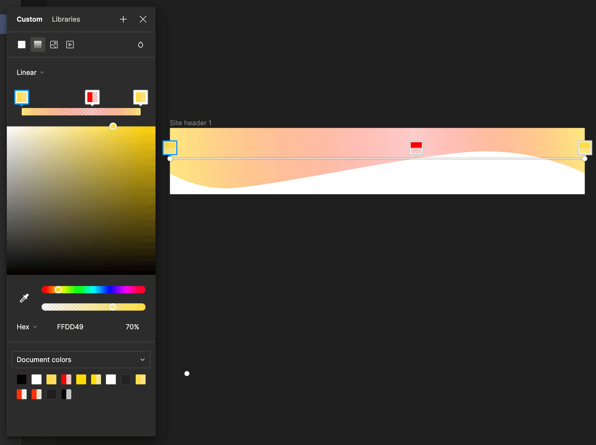
Then, set the leftmost stop and the rightmost stop to the same color and
opacity.
🎉 Ta-da! An SVG that perfectly tiles horizontally.
I made two of these SVGs with different curves and gradients to overlap later on in the layout.
The CSS
To accomplish the ethereal blobby-ness of my header, I use a combination of 2 SVGs, CSS filters, and a CSS animation. Here is the relevant CSS:
nav.css
@keyframes rotateHue {
  from {
    filter: hue-rotate(0deg) blur(10px);
    background-position: 0 0;
  }
  to {
    filter: hue-rotate(360deg) blur(10px);
    background-position: 700px 0;
  }
}

.nav-background-1 {
  animation: rotateHue 60s linear infinite;
}

.nav-background-2 {
  animation: rotateHue 30s linear -9s reverse infinite;
}
Reversing the second animation makes the background images move in opposite
directions, and setting a -9s delay makes the animation start with them
already having different values for hue-rotate for a bit more of a random
feel. I set the blur inside the animation, rather than in the SVG or in
separate CSS for two reasons
- It was harder not to have a repeat boundary line when adding the blur as an SVG filter
- It's impossible to set it in separate CSS without having the animation
filterproperty overwrite it, or vice versa
Here's a screen recording of the final product, with the animation sped up.
Wishlist
A couple ways this could be improved:
- Programmatically generate the background images - this would allow for a lot
of flexibility. The SVGs are fairly simple
paths, and could most likely be generated at request time no sweat, or definitely at build time. If I was more well-versed in generating bezier curves, I'd try this. - More layers - it'd be interesting to experiment with the number of layers. The current product looks a bit like a lava lamp owing to the two layers.
DId you implement something on this list? Let me know!
That's all for now! See you next time (on a more fully functioning site) for a writeup of how this site works.